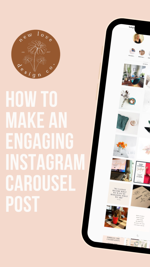
Can you guys tell me what type of post is shared and saved most often on Instagram? You’ve got it, my savvy friend. The Instagram Carousel Post. These types of posts are the single greatest way to increase your engagement on Instagram because they stop the scroll and add (cha-ching!) value. The more shares and saves, the more Instagram rewards your post by showing it to more people in your targeted demographic and interest area.
We all crave those saves and shares.
But before we move on to creating, just what is the Instagram carousel?
So glad you asked!
What is an Instagram Carousel and why Do you NEED it in your Life?
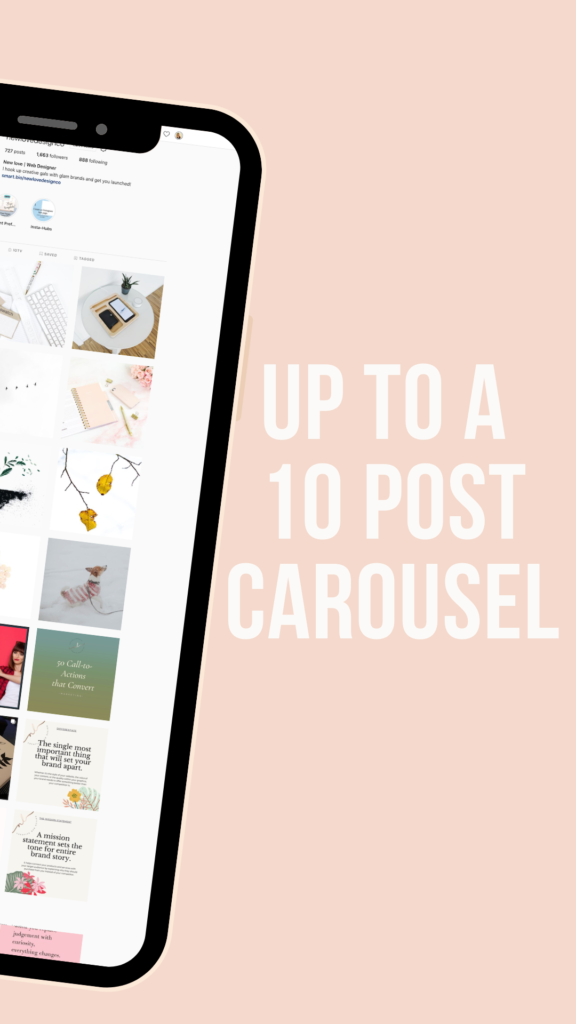
Simply put, the carousel is the multiple image post option. This feature allows a user to post up to 10 photos or videos that a viewer can swipe through. There is exponential growth to be had in the carousel simply because it stops a viewer from scrolling on to another post and elicits their attention purely on you. Genius!
So, how do we design a stellar Instagram Carousel that skyrockets your engagement?
Choose a Concept
Posts that are shared the most on Instagram fall into 3 categories:
- Inspiration
- Education
- Entertainment
I’m sure you could have guessed those!
Be sure to filter your content through one of these categories as it pertains to you or your brand. Focusing on a fan-freaking-tastic design right now is all well and good, however, make sure the content is just as awesome. If the content isn’t beneficial to your viewers, there’s no reason for them to stick around and share with others.
Got your content? Great! Let’s design that Instagram Carousel.
Now, how many slides are you going to be using in your Instagram Carousel?
Instagram isn’t really a stickler when it comes to post sizes – they are quite generous and allow for landscape, port straight, or square. They are even quite accommodating when you get your sizing wrong and auto-adjust (whoops-been there!). When it comes to your Carousel Post, you’ll want to choose from either the Portrait size (1080×1350) or the Square (1080×1080). These sizing options are easy to find when designing your Carousel in Canva. You can choose from hundreds of pre-designed templates or opt to design a template of your own.
PROTIP: If you opt for the Portrait, be sure everything in your post fits within the square grid. The text has been known to get cut-off.
On to Designing your Instagram Carousel!
For this tutorial, I’ll be using Canva Pro. If you don’t have Canva Pro, I absolutely suggest giving it a free trial, and you can do that right here!
If you’re not interested, no worries! You can always use Canva free for as long as they allow.
First things first, go to Canva and start a new Instagram Post design. It is already pre-designed to 1080×1080 dimensions.
Create an Eye-Catching Cover Slide
You want to lure your viewers in, don’t you? So make that headline count. Chances are low that if your headline doesn’t catch their attention, they won’t stop and swipe, meaning zero engagement + wasted effort.
It’s all about the Font
Tall, bold fonts work extremely well when it comes to a cover slide. Choose a slender, bold font to allow for enough room in your messaging as well as your design. Great typography is key to many things in designs — especially when it comes to Carousel Posts.
If your looking for some font ideas, you could give these a try:
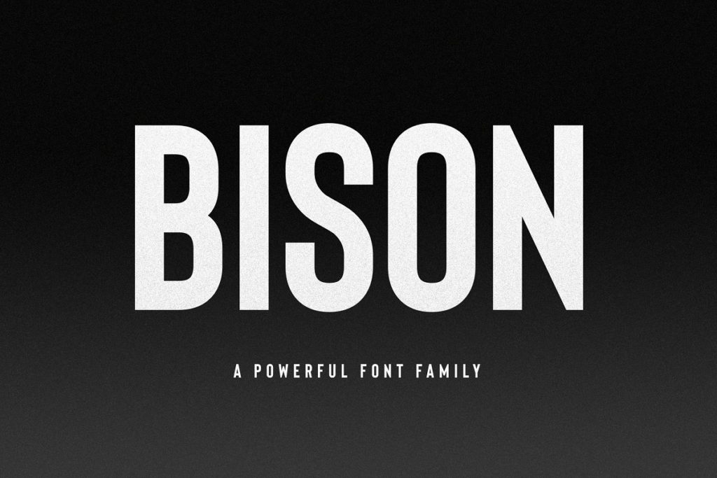
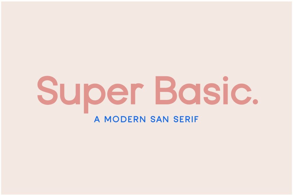

Amazingness Alert!: One of the benefits of Canva Pro is their Brand Kit feature which allows you to not only save your brand colors, logos, and own fonts for easy access (as well as multiple others); it allows you to upload as many fonts as you would like to their already abundant font list. SCORE.
Structuring your Instagram Carousel Post
Just because something looks good doesn’t mean that it’s going to perform well. There are key factors that you need to keep in mind when it comes to structuring your images/content. Ask yourself;
- Does it grab your viewer’s attention?
- Does it address your viewer’s pain points?
- Does it offer a solution?
Your chances of someone saving, sharing, and engaging with your post are much higher when you’ve offered them value, insight, and a way to make their life easier.
The Addition of Effective Imagery
One of my favorite techniques is using bleed-over imagery. Check out how I’ve used the bleed-over effect in my own Carousel Post. When the viewer scrolls through the Instagram Carousel Post, it gives a continuous effect.
Saving your Carousel
Canva is super great about auto-saving your work. When it comes time to complete the project, you are going to want to head on over to the right-hand side of your Canva screen and click on download. Specifications will already be preset to png files and all of your Carousel post screens will be downloaded into a .zip file.
Here’s a peek at what wrapping up the final product will look like. Go ahead a give this a quick watch.
Posting Your Instagram Carousel to Instagram
What I like to do (because I use a Mac) is highlight the .png files as you saw me do at the end of the video above and drag and drop them into my iMessage to myself. Then I save them to my camera roll and post to my Instagram from there. However, there are plenty of ways to upload your images and get your Instagram Post Carousel off and rolling – this is just my preferred method.
Did you know…
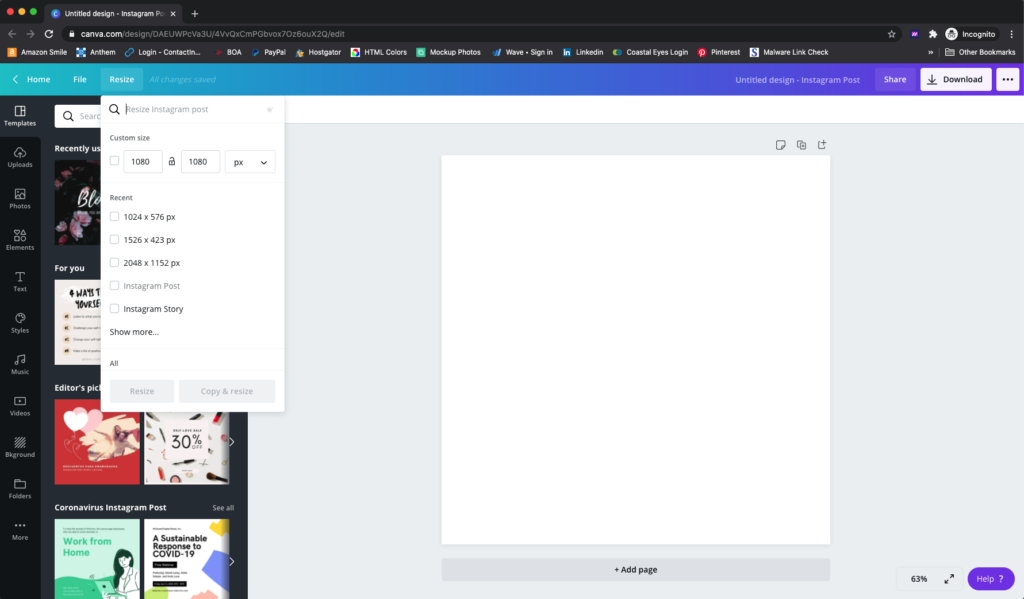
It’s so easy with Canva to turn your Instagram Carousel Post into a Carousel Story with the super easy click of a button! Simply go up to the menu on the left and click “resize.” Look for the “Instagram Story” size and click “copy and resize.” It’s important to click the “copy and resize” so you don’t lose your original. It will look like this.
You will need to adjust the sizing of your images and text once the landscape size has been adjusted, however, that is simple and shouldn’t take long. From there, the process is the same to download your images and upload them to your Instagram story feature.
Let’s Recap What We’ve Just Learned about the Instagram Carousel Post
- Choose what you want to say and be on-brand
- Create cover slide with eye-catching headline
- Structure your posts to grab attention, address pain points, and offer solutions
With strategy and design coupled together, there is nothing stopping you from taking over Instagram. Have you designed a Carousel post yet? Let me know in the comments!
Like what you’ve seen? Go ahead and use this very template!
Instagram Carousel Post Template in Canva by New Love Design Co.


