Waterstone Guitars needed a website that reflected the craftsmanship, legacy, and distinctive personality of their instruments while also making it easier for artists, collectors, and players to explore the brand online. I redesigned and rebuilt the website to create a streamlined experience that highlights their product line, artist relationships, and brand story. The project focused on refining site architecture, improving product presentation, and developing a modern visual layout that still honors the vintage-inspired character Waterstone is known for.
The Challenge
Waterstone Guitars has a strong reputation among musicians and collectors, but their digital presence needed to better match the quality and individuality of the instruments themselves. The existing website made it difficult to easily explore the product catalog, understand the differences between models, and highlight the artists who play them.
The goal was to create a site that felt as intentional as the instruments—one that balanced storytelling with functionality. It needed to clearly present Waterstone’s lineup, support artist relationships, and create a user experience that felt both modern and true to the brand’s retro-inspired identity.
Strategic Focus
This project focused on creating a digital experience that felt as distinctive as the instruments themselves. My goal was to balance brand storytelling with usability—ensuring that visitors could easily explore Waterstone’s lineup while still experiencing the personality and craftsmanship behind the brand.
Key priorities included improving site navigation, organizing the product catalog in a way that felt intuitive for musicians, and elevating the visual presentation of each instrument. The strategy centered on giving the guitars space to stand out while also strengthening Waterstone’s identity through thoughtful layout, imagery, and typography.
Key Features
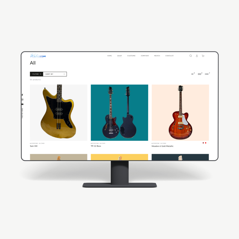
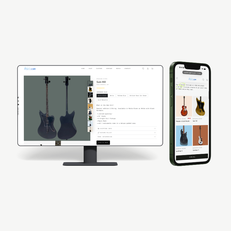
• Restructured site architecture to create a clearer navigation flow between instruments, artists, and brand information • Product-focused design that highlights individual guitar models with dedicated pages and clean layouts • Artist integration to showcase musicians who use Waterstone instruments and reinforce brand credibility • Streamlined user experience that makes it easier for visitors to browse models and understand product differences • Modern visual design that maintains the vintage-inspired personality of the brand • Mobile-friendly layout ensuring the site performs well across devices
The Outcome
My approach focused on simplifying the experience while strengthening the brand presentation.
I began by restructuring the site architecture so visitors could easily navigate between instrument models, artist features, and company information. From there, I refined the product layout to give each instrument space to stand on its own—allowing the design, specifications, and imagery to work together rather than compete for attention.
Visually, the goal was to create a clean and modern interface while still preserving the personality that makes Waterstone unique. The design emphasizes strong imagery, clear typography, and a layout that feels both contemporary and timeless—mirroring the brand’s blend of modern craftsmanship and vintage influence.
The goal was to create a site that felt as intentional as the instruments—one that balanced storytelling with functionality. It needed to clearly present Waterstone’s lineup, support artist relationships, and create a user experience that felt both modern and true to the brand’s retro-inspired identity.