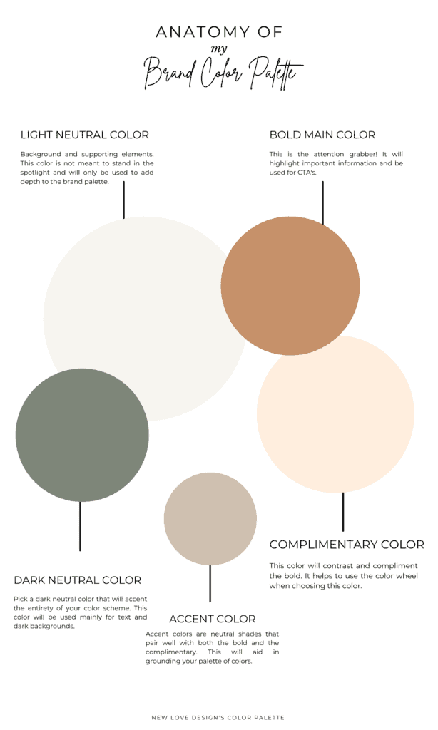
Have you ever heard someone say, “Ugh, that color is gross!” Okay. I have. A lot of people said that about the burnt orange color in my brand palette when I showed it by itself when I was thinking of using it. That color came to me from a Sherwin Williams trip a few fall seasons ago when I got the idea to paint my living room much like this palette. I brought the can of paint home and my boyfriend nearly had a coronary when I popped the lid off.
Oh, boys.
I will admit that from time to time I’ve been known to be a bit judgmental about color here and there, but when you take a step back and truly look, there really is no such thing as an ugly color. Why? Because my love — we have complimentary colors as well as accent pieces. With these wonderful contributions, a sometimes garish or unsettling Pantone can be toned correctly and turned into a unique palette.
Science is behind creating the perfect brand palette and the process can often be overwhelming to some. So to start, how about we go over some questions I typically ask my clients in order to determine what their palette should consist of.
First things first…
Give me 3 adjectives to describe your brand. (i.e. is your brand romantic, relaxed, sophisticated?)
When you choose a particular color a certain adjective will come to mind. It’s emotional (emotional branding, but we can talk about this later!) Choosing dark reds speak romance and light blues whisper calm and relaxation — which also speak to particular professions. A simple understanding of this color theory is helpful before delving deep into choosing your colors in your palette.
Tips of the Trade
Trends come and Go… Timeless is Forever
Updating your logo over time is inevitable, however that’s a great thing because that means you’ve made it! You’ve been in business for years and it’s time for a change. What you don’t want to do is overhaul your logo completely so making sure you start out on the right path is important. Choose the appropriate colors to your profession and timeless over trendy.
Choosing timeless colors will also ensure your brand requires less updates over time in order to stay current. Your brand will stay strong and have increased brand recognition simply because of less modification. Keeping your brand recognition strong helps your consumer easily identify your product/service and builds valuable trust and awareness.
Pick colors relevant to your brand
Choosing colors relevant to your profession is key. If you were a jeweler you wouldn’t choose a palette built for a life coach, would you? No. Because then you wouldn’t build strong brand reocnigtion with your target audience. It’s important to be relevant to your brand’s values, mission, and MISSION. Your colors are your brand’s way of reflecting your business’s services.
Stay True to You
All of this talk about choosing colors relevant to your brand, I forgot to mention that you need to choose an appropriate palette that reflects your image as well. Your brand should always appeal to your audience but remember, it is also a direct reflection of you. If you don’t absolutely love what your brand is reflecting, it’s likely you are going to want to change out those colors for something new and you’ll do it over and over again. Get it right the first time by combining your brand and yourself into one unique palette that you can love forever.
The Brand Color Palette Formula
Want to create your own palette with my easy-to-use template?
Click the image to get started!
*This is a Canva template. When opened, be sure to create a copy before beginning or your work will not be saved.
Your Two Main Colors
- Grab attention
- Highlight important information
- Be used for CTA’s
- Represent your entire brand


